# Iconify for React
Iconify for React is not yet another icon component! There are many of them already.
Iconify is the most versatile icon framework.
- Unified icon framework that can be used with any icon library.
- Out of the box includes 60+ icon sets with 50,000 icons.
- Embed icons in HTML with SVG framework or components for front-end frameworks.
- Embed icons in designs with plug-ins for Figma, Sketch and Adobe XD.
- Add icon search to your applications with Iconify Icon Finder.
For more information visit [https://iconify.design/](https://iconify.design/).
Iconify for React is a part of Iconify framework that makes it easy to use many icon libraries with React.
Iconify for React features:
- Easy to use.
- Bundles only icons that you need.
- Change icon size and colour by changing font size and colour.
- Renders pixel-perfect SVG.
## Installation
If you are using NPM:
```bash
npm install --save-dev @iconify/react
```
If you are using Yarn:
```bash
yarn add --dev @iconify/react
```
This package does not include icons. Icons are split into separate packages that available at NPM. See below.
## Usage
Install `@iconify/react` and packages for selected icon sets. Import `Icon` and/or `InlineIcon` from `@iconify/react` and icon data for icon you want to use:
```typescript
import { Icon, InlineIcon } from '@iconify/react';
import home from '@iconify/icons-mdi-light/home';
import faceWithMonocle from '@iconify/icons-twemoji/face-with-monocle';
```
Then use `Icon` or `InlineIcon` component with icon data as "icon" parameter:
```jsx
This is some text with
```
### String syntax
String syntax passes icon name to the component.
With this method the icon needs to be added only once. That means if you have multiple components using 'home' icon, you can add it only in your main component. This makes it easy to swap icons for an entire application.
```jsx
import React from 'react';
import { Icon, InlineIcon, addIcon } from '@iconify/react';
import homeIcon from '@iconify/icons-mdi-light/home';
addIcon('home', homeIcon);
export function MyComponent() {
return (
);
}
```
## Icon and InlineIcon
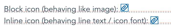
Both components are the same, the only difference is `InlineIcon` has a negative vertical alignment, so it behaves like a glyph.
Use `Icon` for decorations, `InlineIcon` if you are migrating from glyph font.
Visual example to show the difference between inline and block modes:
## Icon component properties
`icon` property is mandatory. It tells component what icon to render. If the property value is invalid, the component will render an empty icon. The value can be a string containing the icon name (icon must be registered before use by calling `addIcon`, see instructions above) or an object containing the icon data.
The icon component has the following optional properties:
- `inline`. Changes icon behaviour to match icon fonts. See "Icon and InlineIcon" section above.
- `width` and `height`. Icon dimensions. The default values are "1em" for both. See "Dimensions" section below.
- `color`. Icon colour. This is the same as setting colour in style. See "Icon colour" section below.
- `flip`, `hFlip`, `vFlip`. Flip icon horizontally and/or vertically. See "Transformations" section below.
- `rotate`. Rotate icon by 90, 180 or 270 degrees. See "Transformations" section below.
- `align`, `vAlign`, `hAlign`, `slice`. Icon alignment. See "Alignment" section below.
### Other properties and events
In addition to the properties mentioned above, the icon component accepts any other properties and events. All other properties and events will be passed to generated `SVG` element, so you can do stuff like assigning `onClick` event, setting the inline style, add title and so on.
### Dimensions
By default, icon height is "1em". With is dynamic, calculated using the icon's width to height ratio.
There are several ways to change icon dimensions:
- Setting `font-size` in style (or `fontSize` if you are using inline style).
- Setting `width` and/or `height` property.
Values for `width` and `height` can be numbers or strings.
If you set only one dimension, another dimension will be calculated using the icon's width to height ratio. For example, if the icon size is 16 x 24, you set the height to 48, the width will be set to 32. Calculations work not only with numbers, but also with string values.
#### Dimensions as numbers
You can use numbers for `width` and `height`.
```jsx
```
```jsx
```
Number values are treated as pixels. That means in examples above, values are identical to "24px" and "16px".
#### Dimensions as strings without units
If you use strings without units, they are treated the same as numbers in an example above.
```jsx
```
```jsx
```
#### Dimensions as strings with units
You can use units in width and height values:
```jsx
```
Be careful when using `calc`, view port based units or percentages. In SVG element they might not behave the way you expect them to behave and when using such units, you should consider settings both width and height.
#### Dimensions as 'auto'
Keyword "auto" sets dimensions to the icon's `viewBox` dimensions. For example, for 24 x 24 icon using `height="auto"` sets height to 24 pixels.
```jsx
```
### Icon colour
There are two types of icons: icons that do not have a palette and icons that do have a palette.
Icons that do have a palette, such as emojis, cannot be customised. Setting colour to such icons will not change anything.
Icons that do not have a palette can be customised. By default, colour is set to "currentColor", which means the icon's colour matches text colour. To change the colour you can:
- Set `color` style or use stylesheet to target icon. If you are using the stylesheet, target `svg` element.
- Add `color` property.
Examples:
Using `color` property:
```jsx
```
Using inline style:
```jsx
```
Using stylesheet:
```jsx
```
```css
.red-icon {
color: red;
}
```
### Transformations
You can rotate and flip the icon.
This might seem redundant because icon can also be rotated and flipped using CSS transformations. So why do transformation properties exist? Because it is a different type of transformation.
- CSS transformations transform the entire icon.
- Icon transformations transform the contents of the icon.
If you have a square icon, this makes no difference. However, if you have an icon that has different width and height values, it makes a huge difference.
Rotating 16x24 icon by 90 degrees results in:
- CSS transformation keeps 16x24 bounding box, which might cause the icon to overlap text around it.
- Icon transformation changes bounding box to 24x16, rotating content inside an icon.
_TODO: show visual example_
#### Flipping an icon
There are several properties available to flip an icon:
- `hFlip`: boolean property, flips icon horizontally.
- `vFlip`: boolean property, flips icon vertically.
- `flip`: shorthand string property, can flip icon horizontally and/or vertically.
Examples:
Flip an icon horizontally:
```jsx
```
Flip an icon vertically:
```jsx
```
Flip an icon horizontally and vertically (the same as 180 degrees rotation):
```jsx
```
#### Rotating an icon
An icon can be rotated by 90, 180 and 270 degrees. Only contents of the icon are rotated.
To rotate an icon, use `rotate` property. Value can be a string (degrees or percentages) or a number.
Number values are 1 for 90 degrees, 2 for 180 degrees, 3 for 270 degrees.
Examples of 90 degrees rotation:
```jsx
```
### Alignment
Alignment matters only if you set the icon's width and height properties that do not match the viewBox with and height.
For example, if the icon is 24x24 and you set the width to 32 and height to 24. You must set both `width` and `height` properties for this to happen or use stylesheet to set both icon's width and height.
#### Stretching SVG
When you use incorrect width/height ratio for other images, browser stretches those images.
Unlike other images, SVG elements do not stretch. Instead, browser either adds space on sides of the icon (this is the default behaviour) or crops part of the icon.

#### Alignment properties
You can control the behaviour of SVG when using incorrect width/height ratio by setting alignment properties:
- `hAlign`: string property to set horizontal alignment. Possible values are "left", "center" and "right".
- `vAlign`: string property to set vertical alignment. Possible values are "top", "middle" and "bottom".
- `slice`: boolean property. See below.
- `align`: shorthand string property. Value is the combination of vertical alignment values, horizontal alignment values, "meet" (same as `slice={false}`) and "slice" (same as `slice={true}`) separated by comma.
Example of aligning an icon to the left if icon is not square:
```jsx
```
#### Slice
Slice property tells the browser how to deal with extra space.
By default, `slice` is disabled. The browser will scale the icon to fit the bounding box.
Example showing the icon behaviour when `slice` is disabled with various alignment values:

If `slice` is enabled, the browser will scale the icon to fill the bounding box and hide parts that do not fit.
Example showing the icon behaviour when `slice` is enabled with various alignment values:

## Icon Packages
As of version 1.1.0 this package no longer includes icons. There are over 40k icons, each in its own file. That takes a lot of disc space. Because of that icons were moved to multiple separate packages, one package per icon set.
You can find all available icons at https://iconify.design/icon-sets/
Browse or search icons, click any icon and you will see a "React" tab that will give you exact code for the React component.
Import format for each icon is "@iconify/icon-{prefix}/{icon}" where {prefix} is collection prefix, and {icon} is the icon name.
Usage examples for a few popular icon packages:
### Material Design Icons
Package: https://www.npmjs.com/package/@iconify/icons-mdi
Icons list: https://iconify.design/icon-sets/mdi/
Installation:
```bash
npm install --save-dev @iconify/icons-mdi
```
Usage:
```js
import { Icon, InlineIcon } from '@iconify/react';
import home from '@iconify/icons-mdi/home';
import accountCheck from '@iconify/icons-mdi/account-check';
```
```jsx
This is some text with
```
### Simple Icons (big collection of logos)
Package: https://www.npmjs.com/package/@iconify/icons-simple-icons
Icons list: https://iconify.design/icon-sets/simple-icons/
Installation:
```bash
npm install --save-dev @iconify/icons-simple-icons
```
Usage:
```js
import { Icon, InlineIcon } from '@iconify/react';
import behanceIcon from '@iconify/icons-simple-icons/behance';
import mozillafirefoxIcon from '@iconify/icons-simple-icons/mozillafirefox';
```
```jsx
Mozilla Firefox is the best
browser!
```
### Font Awesome 5 Solid
Package: https://www.npmjs.com/package/@iconify/icons-fa-solid
Icons list: https://iconify.design/icon-sets/fa-solid/
Installation:
```bash
npm install --save-dev @iconify/icons-fa-solid
```
Usage:
```js
import { Icon, InlineIcon } from '@iconify/react';
import toggleOn from '@iconify/icons-fa-solid/toggle-on';
import chartBar from '@iconify/icons-fa-solid/chart-bar';
```
```jsx
Click to toggle
```
### Noto Emoji
Package: https://www.npmjs.com/package/@iconify/icons-noto
Icons list: https://iconify.design/icon-sets/noto/
Installation:
```bash
npm install --save-dev @iconify/icons-noto
```
Usage:
```js
import { Icon, InlineIcon } from '@iconify/react';
import greenApple from '@iconify/icons-noto/green-apple';
import huggingFace from '@iconify/icons-noto/hugging-face';
```
```jsx
Its time for hugs !
```
### Other icon sets
There are over 50 icon sets. This readme shows only a few examples. See [Iconify icon sets](http://iconify.design/icon-sets/) for a full list of available icon sets. Click any icon to see code.
## License
React component is released with MIT license.
© 2019, 2020 Vjacheslav Trushkin
See [Iconify icon sets page](https://iconify.design/icon-sets/) for list of collections and their licenses.