What is Iconify?
There are many excellent icon sets available. Each icon set has its own custom syntax, some are available only as fonts. Unfortunately, almost all of them load an entire set, even if you are displaying just a few icons. This makes it hard to use different icon sets.
Iconify tries to unify all icon sets. You can use the same code no matter what icon set you choose. You can mix icons from multiple icon sets on the same page.
Iconify is the most versatile icon framework.
- Unified icon framework that can be used with any icon library.
- Out of the box includes 100+ icon sets with more than 100,000 icons.
- Embed icons in HTML with Iconify icon web component and components for various front-end frameworks.
- Embed icons in designs with plug-ins for Figma, Sketch and Adobe XD.
- Add icon search to your applications with Iconify Icon Finder.
For more information visit https://iconify.design/.
IconifyIcon web component
Iconify Icon web component renders icons.
Add this line to your page to load IconifyIcon (you can add it to <head> section of the page or before </body>):
<script src="https://code.iconify.design/iconify-icon/0.0.1/iconify-icon.min.js"></script>
or
<script src="https://cdn.jsdelivr.net/npm/iconify-icon@0.0.1/dist/iconify-icon.min.js"></script>
or, if you are building a project with something like WebPack or Rollup, you can include the script by installing iconify-icon as a dependency and importing it in your project:
import IconifyIcon from 'iconify-icon';
To add any icon, write something like this:
<iconify-icon icon="eva:people-outline"></iconify-icon>

That is it. Change icon attribute to the name of the icon you want to use. There are over 100,000 premade icons to choose from, including Material Symbols, Photphor, Remix Icons, Carbon, Unicons, Bootstrap Icons and even several emoji sets.
Do you want to make your own icon sets? Everything you need is available on GitHub: tools for creating custom icon sets, Iconify API application and documentation to help you.
Full documentation
This package is in development, documentation for it is not ready yet.
Until it is ready, you can look at SVG framework documentation instead:
- SVG framework documentation.
- React component documentation.
- Iconify API documentation.
- Creating icon bundles.
- Iconify Tools documentation.
How does it work?
Iconify icon script registers a web component iconify-icon.
Web component uses the following logic to render icon:
- Retrieves icon name from
iconattribute. - Checks if icon exists. If not, it sends a request to Iconify API to retrieve icon data.
- Renders icon in shadow DOM in web component.
Inline mode
Usually, icon fonts do not render like normal images, they render like text. Text is aligned slightly below the baseline.
Visual example to show the difference between inline and block modes:
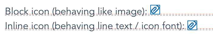
To help developers, Iconify Icon has inline mode.
Why is the inline mode needed?
- To easily align icons within the text, such as emojis.
- To make the transition from outdated icon fonts to SVG easier.
You can toggle inline mode by adding inline attribute:
<iconify-icon inline icon="material-symbols:account-circle"></iconify-icon>
You can also do that by applying style:
<iconify-icon
	icon="material-symbols:account-circle"
	style="vertical-align: -0.125em"
></iconify-icon>
Iconify API
When you use an icon font, each visitor loads an entire font, even if your page only uses a few icons. This is a major downside of using icon fonts. That limits developers to one or two fonts or icon sets.
Unlike icon fonts, Iconify Icon web component does not load the entire icon set. Unlike fonts and SVG frameworks, Iconify only loads icons that are used on the current page instead of loading entire icon sets. How is it done? By serving icons dynamically from publicly available JSON API.
Custom API
Relying on a third party service is often not an option. Many companies and developers prefer to keep everything on their own servers to have full control.
Iconify API and icon sets are all available on GitHub, making it easy to host API on your own server.
For more details see Iconify API documentation.
You can also create custom Iconify API to serve your own icons. For more details see hosting custom icons in Iconify documentation.
Using Iconify offline
While the default method of retrieving icons is to retrieve them from API, there are other options. Iconify Icon web component is designed to be as flexible as possible.
Easiest option to serve icons without API is by creating icon bundles.
Icon bundles are small scripts that you can load after Iconify Icon web component or bundle it together in one file.
For more details see icon bundles in Iconify documentation.
Another option is to import icons and bundle them with Iconify, similar to React and Vue components. Example:
// Installation: npm install --save-dev iconify-icon
import { addIcon } from 'iconify-icon';
// Installation: npm install --save-dev @iconify/icons-dashicons
import adminUsers from '@iconify/icons-dashicons/admin-users';

// Unlike React and Vue components, in SVG framework each icon added with addIcon() name must have a
// prefix and a name. In this example prefix is "dashicons" and name is "admin-users".
addIcon('dashicons:admin-users', adminUsers);
<iconify-icon icon="dashicons:admin-users"></iconify-icon>
See Iconify for React documentation for more details.
Color
There are 2 types of icons: monotone and coloured.
- Monotone icons are icons that use only 1 colour and you can change that colour. Most icon sets fall into this category: FontAwesome, Unicons, Material Design Icons, etc.
- Coloured icons are icons that use the preset palette. Most emoji icons fall into this category: Noto Emoji, Emoji One, etc. You cannot change the palette for those icons.
Monotone icons use font colour, just like glyph fonts. To change colour, you can do this:
<iconify-icon class="icon-bell" icon="vaadin-bell"></iconify-icon>
and add this to CSS:
.icon-bell {
	color: #f80;
}
.icon-bell:hover {
	color: #f00;
}
Sample:
Dimensions
By default all icons are scaled to 1em height. To control icon height use font-size:
<iconify-icon class="icon-clipboard" icon="emojione-clipboard"></iconify-icon>
and add this to css:
.icon-clipboard {
	font-size: 32px;
}
Sample:
you might also need to set line-height:
.icon-clipboard {
	font-size: 32px;
	line-height: 1em;
}
You can also set custom dimensions using width and height attributes:
<iconify-icon icon="twemoji-ice-cream" width="32" height="32"></iconify-icon>
Sample:
Transformations
You can rotate and flip icon by adding flip and rotate attributes:
<iconify-icon icon="twemoji-helicopter" flip="horizontal"></iconify-icon>
<iconify-icon icon="twemoji-helicopter" rotate="90deg"></iconify-icon>
Possible values for flip: horizontal, vertical.
Possible values for rotate: 90deg, 180deg, 270deg.
If you use both flip and rotation, the icon is flipped first, then rotated.
To use custom transformations use CSS transform rule.
<iconify-icon icon="twemoji-helicopter" class="icon-helicopter"></iconify-icon>
.icon-helicopter {
	transform: 45deg;
}
Samples:
Available icons
There are over 100,000 icons to choose from.
Few popular icon sets (monotone icons):
- Material Symbols (7000+ icons)
- Material Design Icons (5000+ icons)
- Carbon (1000+ icons)
- Unicons (1000+ icons)
- Jam Icons (900 icons)
- IonIcons (1200+ icons)
- FontAwesome 6 (2000+ icons)
- Bootstrap Icons (500+ icons)
- IcoMoon Free (400+ icons)
- Dashicons (300 icons)
and many others.
Emoji collections (mostly colored icons):
- Emoji One (1800+ colored version 2 icons, 1400+ monotone version 2 icons, 1200+ version 1 icons)
- OpenMoji (3500+ icons)
- Noto Emoji (2000+ icons for version 2, 2000+ icons for version 1)
- Twitter Emoji (2000+ icons)
- Firefox OS Emoji (1000+ icons)
Also, there are several thematic collections, such as weather icons, map icons, etc.
You can use browse or search available icons on the Iconify website: https://icon-sets.iconify.design/
Click an icon to get HTML code.
Browser support
Iconify web component supports all modern browsers.
License
This package is licensed under MIT license.
SPDX-License-Identifier: MIT
This license does not apply to icons. Icons are released under different licenses, see each icon set for details. Icons available by default are all licensed under some kind of open-source or free license.
© 2022 Vjacheslav Trushkin / Iconify OÜ